
Flutter 中的Scaffold实现了基本的 Material 布局。
只要是在 Material 中定义了的单个界面显示的布局控件元素,都可以使用 Scaffold 来绘制。
可以简单的将Scaffold理解为一个布局的容器。可以在这个容器中绘制我们的用户界面。
自己写了一个简单UI
import 'package:flutter/material.dart';

void main() {
  runApp(
    MaterialApp( //这些是具名属性,使用匿名类
      debugShowCheckedModeBanner: false, //关闭debug显示
      home: Scaffold( //Scaffold是一个容器实现了基本的 Material 布局。
        appBar: AppBar( //appBar就是标题栏
          title: Text("Hello Rectangle"), //标题栏中的属性,文本内容
        ),
        body: HelloRectangle(),
      ),
    ),
  );
}

class HelloRectangle extends StatelessWidget {
  @override
  Widget build(BuildContext context) {
    return Center(
      child: Container(
          color: Colors.blueAccent,
          height: 400.0,
          width: 415.0,
          child: Center(
            child: Text(
              'hello',
              style: TextStyle(fontSize: 40.0),
            ),
          )),
    );
  }
}
appBar(重点)
就是显示在页面顶部的文本
源码示例:
构造函数如下:
AppBar({
  Key key,
  this.leading, //导航栏最左侧Widget,常见为抽屉菜单按钮或返回按钮。
  this.automaticallyImplyLeading = true, //如果leading为null,是否自动实现默认的leading按钮
  this.title,// 页面标题
  this.actions, // 导航栏右侧菜单
  this.bottom, // 导航栏底部菜单,通常为Tab按钮组
  this.elevation = 4.0, // 导航栏阴影
  this.centerTitle, //标题是否居中
  this.backgroundColor,
  ...
})
复制代码
AppBar 和 SliverAppBar 都是 Material Design 中的 App Bar
二者的区别在于 AppBar 的位置是固定在应用最上面的;而 SliverAppBar 是可以跟随内容滚动的。
主要属性:
- leading:在标题前面显示的一个控件,在首页通常显示应用的 logo;在其他界面通常显示为返回按钮,如果给
Scaffold添加了抽屉菜单,默认情况下Scaffold会自动将AppBar的leading设置为菜单按钮 - title:当前页面的标题文字
- actions:一个 Widget 列表,代表 AppBar 中所显示的菜单,对于常用的菜单,通常使用 IconButton 来表示;对于不常用的菜单通常使用 PopupMenuButton 来显示为三个点,点击后弹出二级菜单
- bottom:一个 AppBarBottomWidget 对象,通常是 TabBar。用来在 AppBar 标题下面显示一个 Tab 导航栏
- flexibleSpace:一个显示在 AppBar 下方的控件,高度和 AppBar 高度一样,可以实现一些特殊的效果,该属性通常在 SliverAppBar 中使用
- backgroundColor:AppBar的颜色,默认值为ThemeData.primaryColor。改值通常和下面的三个属性一起使用
- brightness:AppBar 的亮度,有白色和黑色两种主题,默认值为 ThemeData.primaryColorBrightness
- iconTheme:App bar 上图标的颜色、透明度、和尺寸信息。默认值为 ThemeData.primaryIconTheme
- textTheme: App bar 上的文字样式。默认值为 ThemeData.primaryTextTheme
- centerTitle:标题是否居中显示,默认为false,居中显示为true
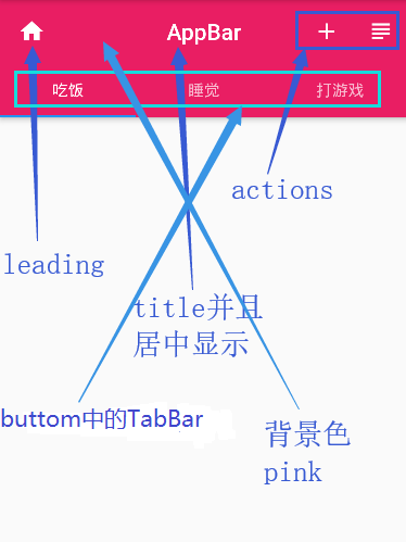
class _CategoryPageState extends State<CategoryPage>
    with SingleTickerProviderStateMixin {

  TabController _tabController; //需要定义一个Controller
  List tabs = ["吃饭", "睡觉", "打游戏"];

  @override
  void initState() {
    // TODO: implement initState
    super.initState();
    // 创建Controller
    _tabController = TabController(length: tabs.length, vsync: this);
  }

  @override
  Widget build(BuildContext context) {
    return Scaffold(
      appBar: AppBar(
        leading: Icon(Icons.home),
        title: Text('AppBar'),	//标题
        backgroundColor: Colors.pink,	//背景色
        centerTitle: true, //标题居中显示
        bottom: TabBar(
          controller: _tabController,
          tabs: tabs
              .map((item) => Tab(
                    text: item,
                  ))
              .toList(),
        ),
        actions: <Widget>[
          IconButton(
            icon: Icon(Icons.add),
            onPressed: () {},
          ),
          IconButton(
            icon: Icon(Icons.subject),
            onPressed: () {},
          ),
        ],
      ),
    );
  }
}
上面通过TabBar我们只能生成一个静态的菜单,真正的Tab页还没有实现,当前你必须点击才可以切换。
但是我们需要用手在上面左右滑动的时候,也可以切换,这个时候就要用到TabBarView组件,并且需要去监听Tab菜单的切换(在下面进行介绍)
body
页面要显示的主体内容,不做过多介绍(下面写代码示例的时候,写一下)
floatingActionButton
在body中定义的一个浮动按钮,默认在屏幕右下方
代码示例:
floatingActionButton: FloatingActionButton(
	child: Icon(Icons.add),
	onPressed: (){},
),
复制代码
运行效果:

floatingActionButtonLocation
可以改变上面的浮动按钮的位置
如:
floatingActionButtonLocation:FloatingActionButtonLocation.centerFloat,
复制代码
可以让按钮在页面底部的中间位置显示 ,下面要实现一种按钮的打洞效果,会用到这个属性
persistentFooterButtons
固定在下方显示的按钮
代码示例:
只贴增加的代码(在Scaffold组件下,与appBar、body平级)
floatingActionButtonLocation: FloatingActionButtonLocation.endTop,
persistentFooterButtons: <Widget>[
	RaisedButton(
	  child: Text("我",style: TextStyle(color: Colors.white),),
	  onPressed: () {},
	),
	RaisedButton(
	  child: Text("你",style: TextStyle(color: Colors.white),),
	  onPressed: () {},
	),
	RaisedButton(
	  child: Text("他",style: TextStyle(color: Colors.white),),
	  onPressed: () {},
	)
],
复制代码
运行效果:

bottomNavigationBar(重点)
显示在页面底部的导航栏
代码示例:
bottomNavigationBar: BottomNavigationBar(
	items: <BottomNavigationBarItem>[
	  //items长度必须大于等于2
	  BottomNavigationBarItem(icon: Icon(Icons.home), title: Text('首页')),
	  BottomNavigationBarItem(icon: Icon(Icons.category), title: Text('分类')),
	  BottomNavigationBarItem(icon: Icon(Icons.people), title: Text('我的')),
	],
),
复制代码
运行效果:

那么如果我们想要实现这种样式的怎么办呢?

也非常简单,Material组件库中提供了一个BottomAppBar组件,它可以和FloatingActionButton配合实现这种“打洞”效果,
代码:
floatingActionButtonLocation: FloatingActionButtonLocation.centerDocked,
bottomNavigationBar: BottomAppBar(
    color: Colors.white,
    shape: CircularNotchedRectangle(), // 底部导航栏打一个圆形的洞,也可以自定义外形
    child: Row(
      children: [
    	IconButton(icon: Icon(Icons.home)),
    	SizedBox(), //中间位置空出
    	IconButton(icon: Icon(Icons.business)),
      ],
      mainAxisAlignment: MainAxisAlignment.spaceAround, //均分底部导航栏横向空间
    ),
),
复制代码注:一定要把FloatingActionButtonLocation的值设置为centerDocked才可以
drawer、endDrawer(重点)
Scaffold的drawer和endDrawer属性可以分别接受一个Widget来作为页面的左、右抽屉菜单。
下面举一个从左边拉出来的菜单的例子:
代码示例:
drawer: Drawer(
    child: MediaQuery.removePadding(
      context: context,
      //移除抽屉菜单顶部默认留白
      removeTop: true,
      child: Column(
    	crossAxisAlignment: CrossAxisAlignment.start,
    	children: <Widget>[
    	  Padding(
    		padding: const EdgeInsets.only(top: 38.0),
    		child: Row(
    		  children: <Widget>[
    			Padding(
    			  padding: const EdgeInsets.symmetric(horizontal: 16.0),
    			  child: ClipOval(
    				child: Image.asset(
    				  "images/Test.jpg",
    				  width: 80,
    				),
    			  ),
    			),
    			Text(
    			  "夜夕i",
    			  style: TextStyle(fontWeight: FontWeight.bold),
    			)
    		  ],
    		),
    	  ),
    	  Expanded(
    		child: ListView(
    		  children: <Widget>[
    			ListTile(
    			  leading: const Icon(Icons.card_travel),
    			  title: const Text('账号管理'),
    			),
    			ListTile(
    			  leading: const Icon(Icons.settings),
    			  title: const Text('设置'),
    			),
    		  ],
    		),
    	  ),
    	],
      ),
    ),
),
复制代码默认屏幕上什么都没有,当你用手在屏幕上面从屏幕左边往右边滑的时候,就会显示出来
效果展示:

backgroundColor
设置body的背景颜色,没什么好说的
TabBarView(重点)
在上面已经说了,appBar中的bottom中的TabBar只能生成一个静态的菜单,真正的Tab页还没有实现,你必须点击才可以切换。
那么如何实现在屏幕上滑动,并且和下面body中的内容实现同步呢?
这个时候就用到了TabView
代码示例:
class _CategoryPageState extends State<CategoryPage>
    with SingleTickerProviderStateMixin {
  TabController _tabController; //需要定义一个Controller
  List tabs = ["吃饭", "睡觉", "打游戏"];

  @override
  void initState() {
    // TODO: implement initState
    super.initState();
    // 创建Controller
    _tabController = TabController(length: tabs.length, vsync: this);
  }

  @override
  Widget build(BuildContext context) {
    return Scaffold(
      appBar: AppBar(
        title: Text('AppBar'),
        centerTitle: true, //标题居中显示
        bottom: TabBar(
          controller: _tabController,
          tabs: tabs
              .map((item) => Tab(
                    text: item,
                  ))
              .toList(),
        ),
      ),
      body: TabBarView(
        controller: _tabController,
        children: tabs.map((e) {
          //创建3个Tab页
          return Container(
            alignment: Alignment.center,
            child: Text(e, textScaleFactor: 5),
          );
        }).toList(),
      ),
    );
  }
}
复制代码
这个时候,无论你是点击上面的吃饭、睡觉、打游戏的按钮,或者用手在屏幕上面左右滑动,都可以实现页面和数据同步
运行效果:

resizeToAvoidBottomPadding(重点)
控制界面内容 body,是否重新布局来避免底部被覆盖了,
比如当键盘显示的时候,重新布局避免被键盘盖住内容。默认值为 true。
作者:YXi
链接:https://juejin.im/post/5d91c6a051882573151b3f0d
来源:掘金